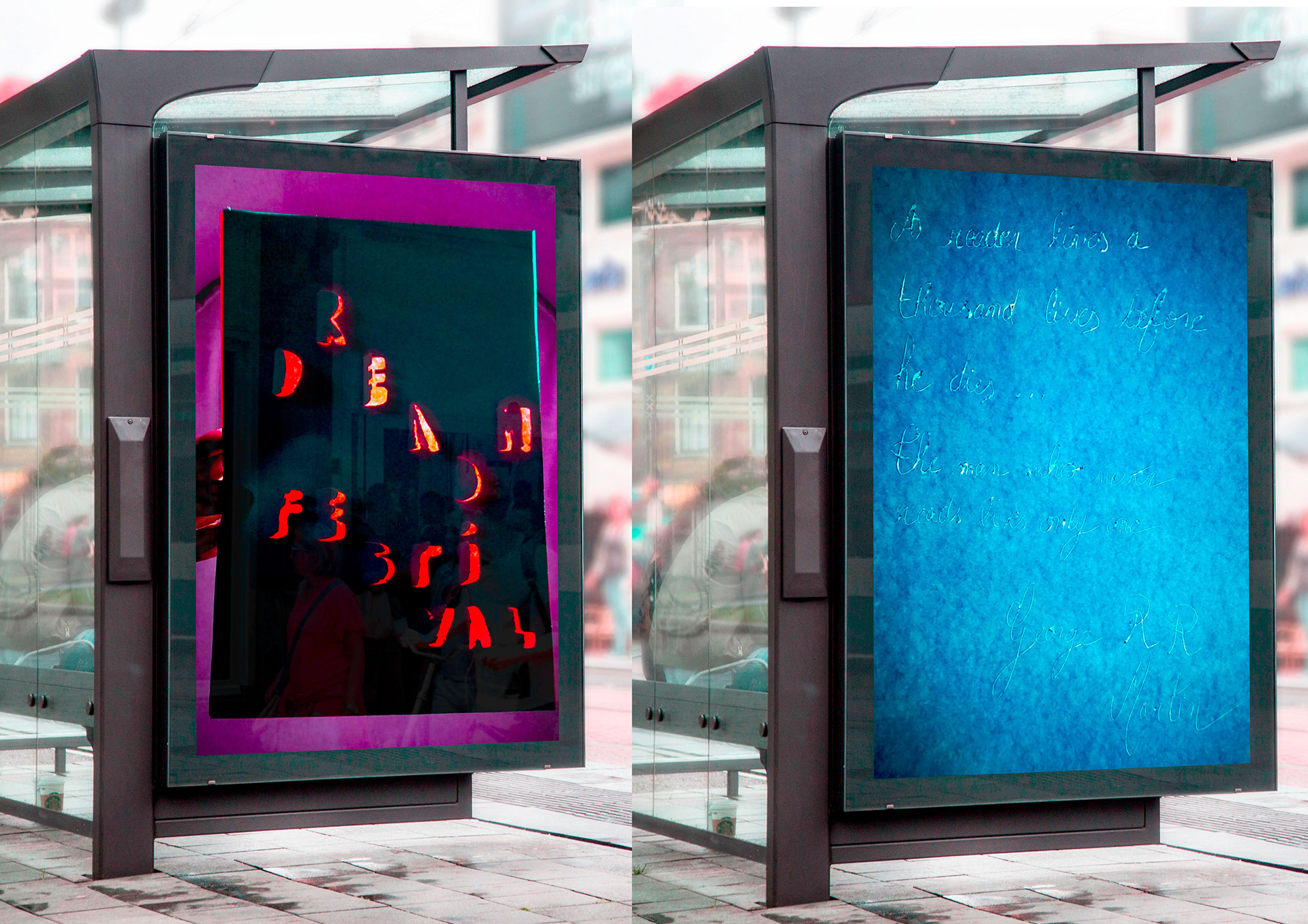
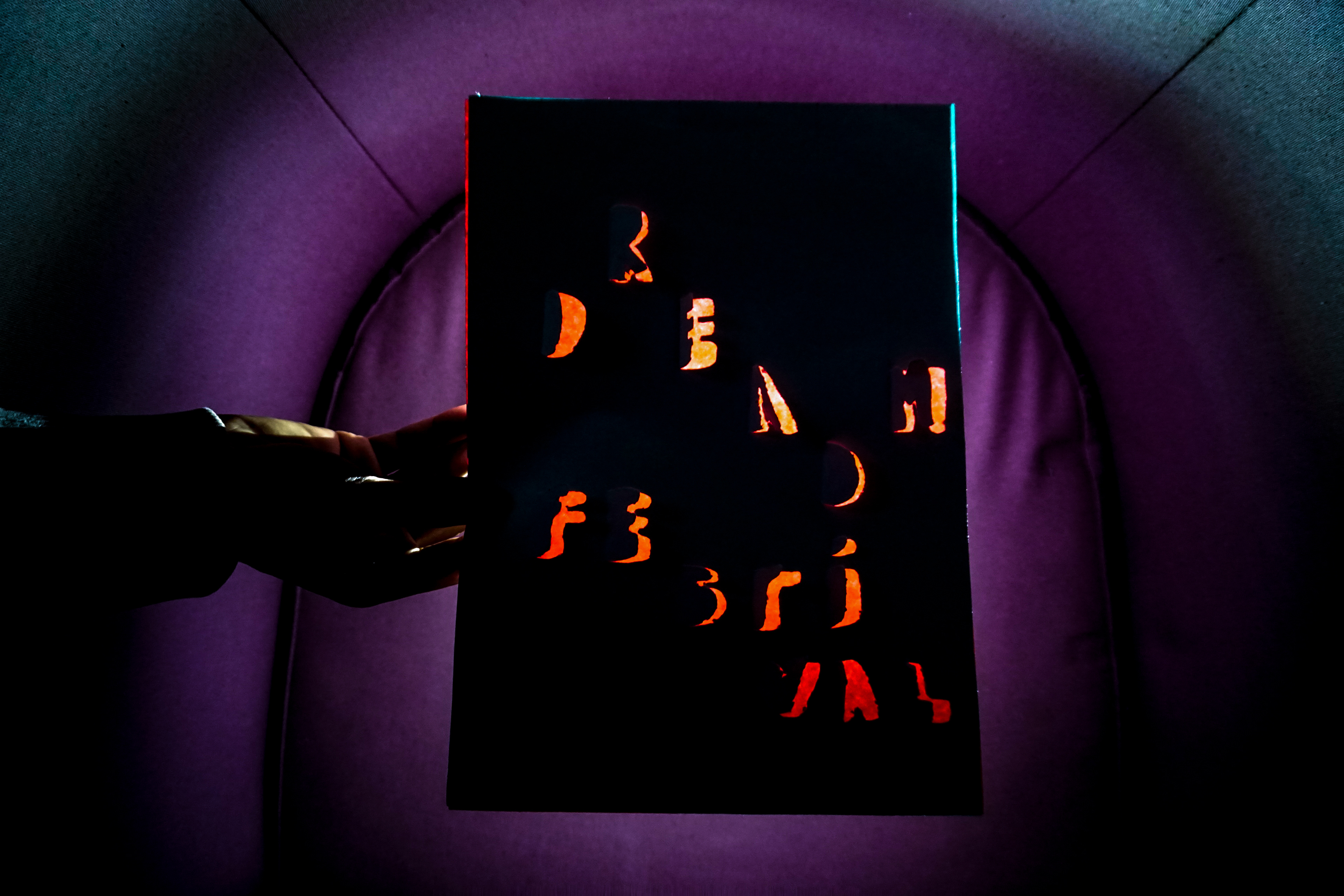
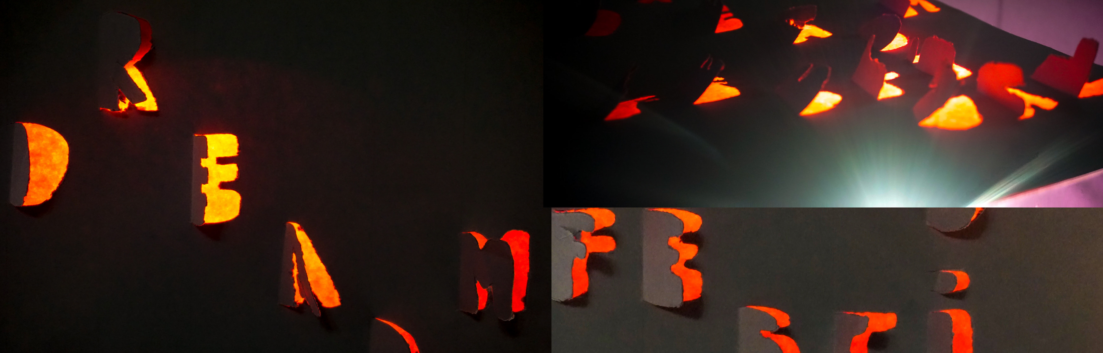
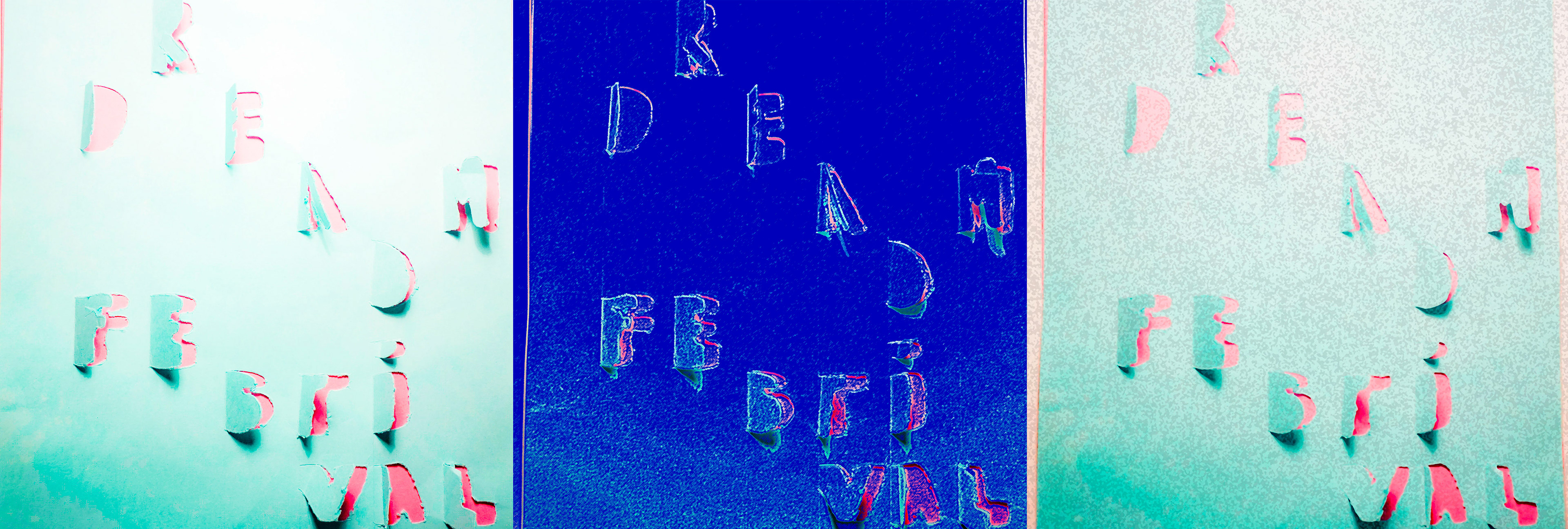
Experimental typography: using found materials I had to design a range of letterforms. I decided to come back to the original concept of writing by using paper. I used a compass to cut each letter that I draw, and a light underneath to reflect the contrast between the two papers. I then imagined that I would do this piece for a book festival: the Dream Read Festival. I decided to not write in a straight light to let the reader lead himself / herself to what he/she wanted to read.
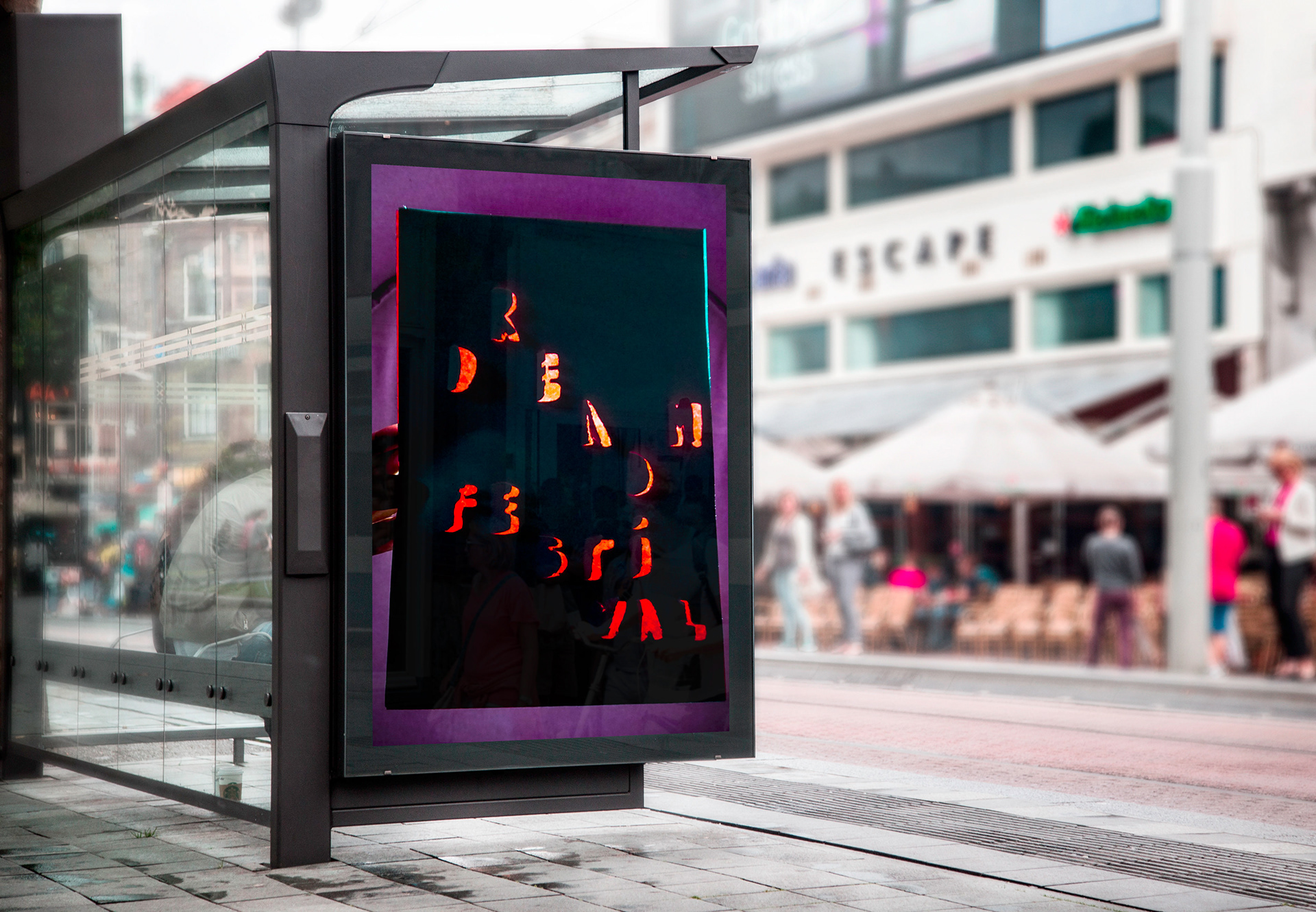
In order to go further with the experimentation, I decided to convert the original piece (on the left) with different effects and see how I could use a real found materials and modify it digitally. I really love the crafty effect of each piece but also the digital output.
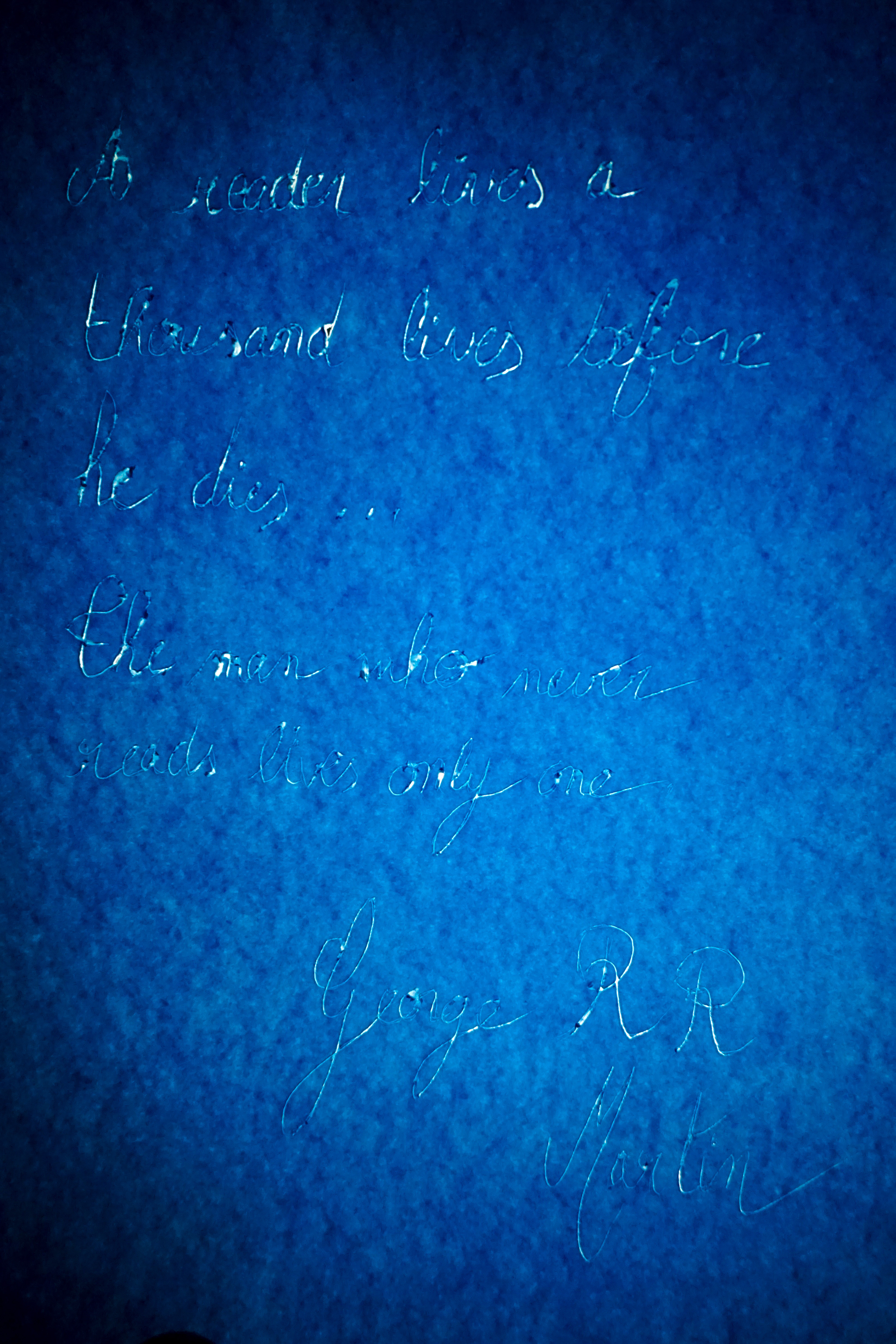
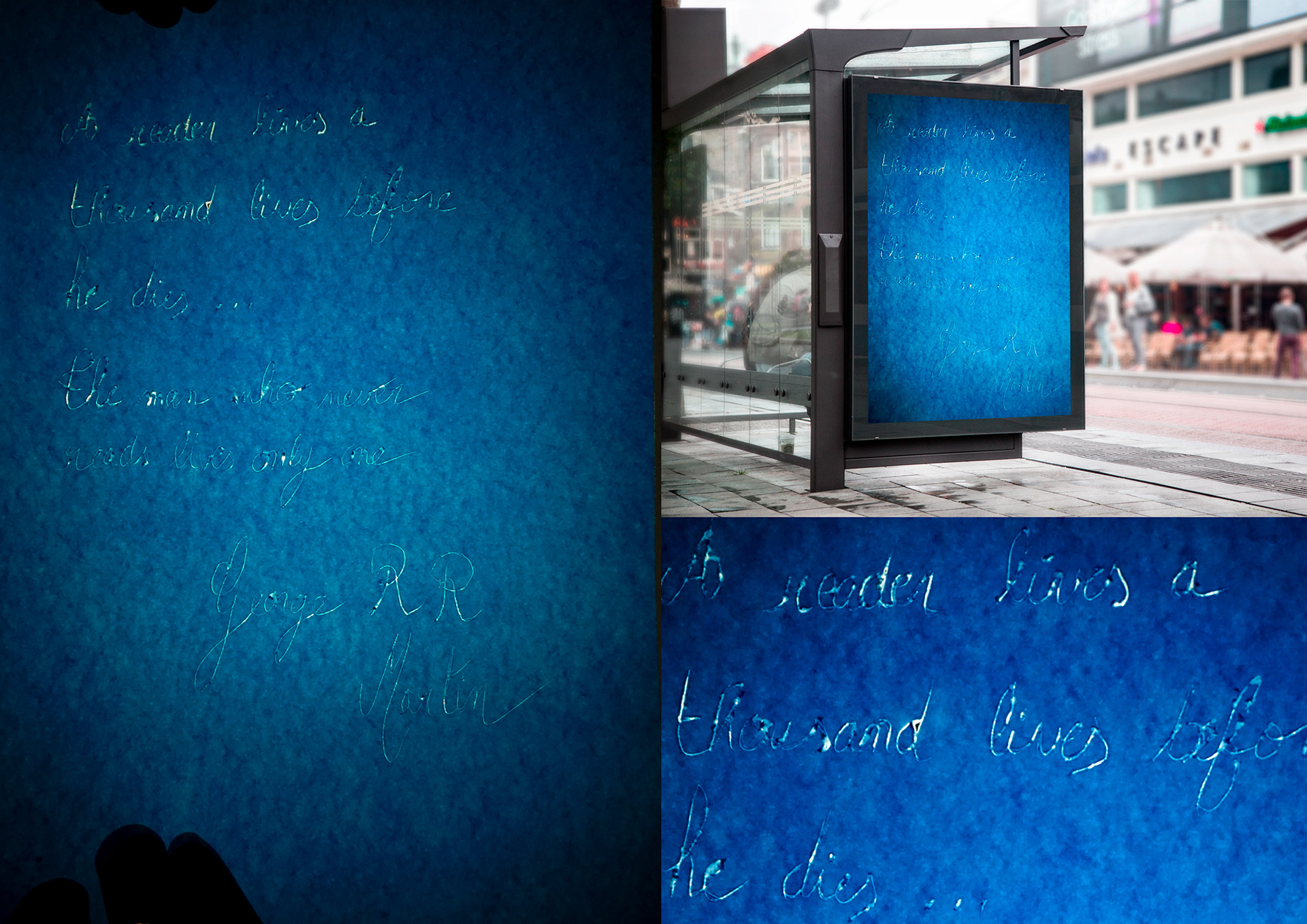
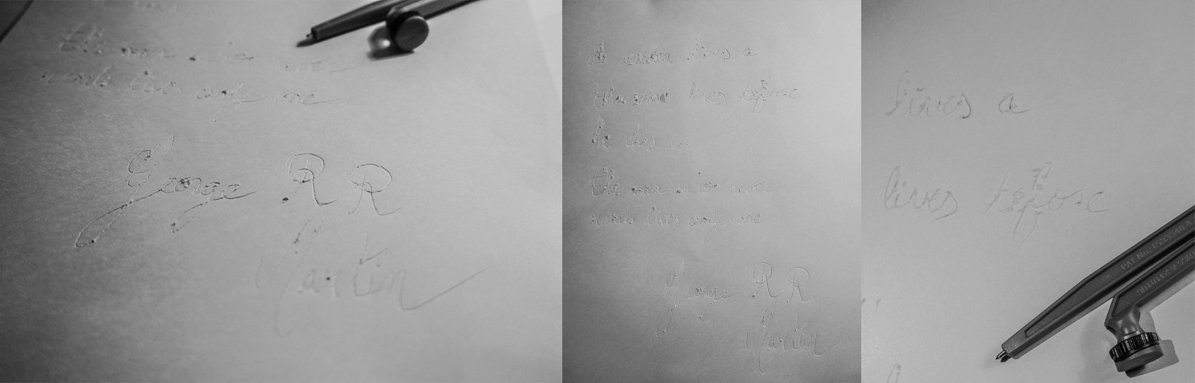
As experimentation when on, I really liked the use of the compass which I recognised as a form of engraving. I decided to go further with it and imagined a campaign for the Dream Read Festival that would have sometimes the poster, and sometimes a quote about what it means to read. The typography used is the style of writing that we learn at school in France, but that also represents poetry, which I thought fit well the message I wanted to convey.
www.endivemole.com